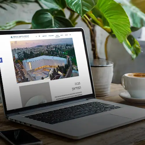
Q BEHAVIORAL THINKING
Validators systems UX - "One Way" revolution 2022 Ministry of Transport and Road Safety
UX DESIGN | UX RESEARCH | PROTOTYPING
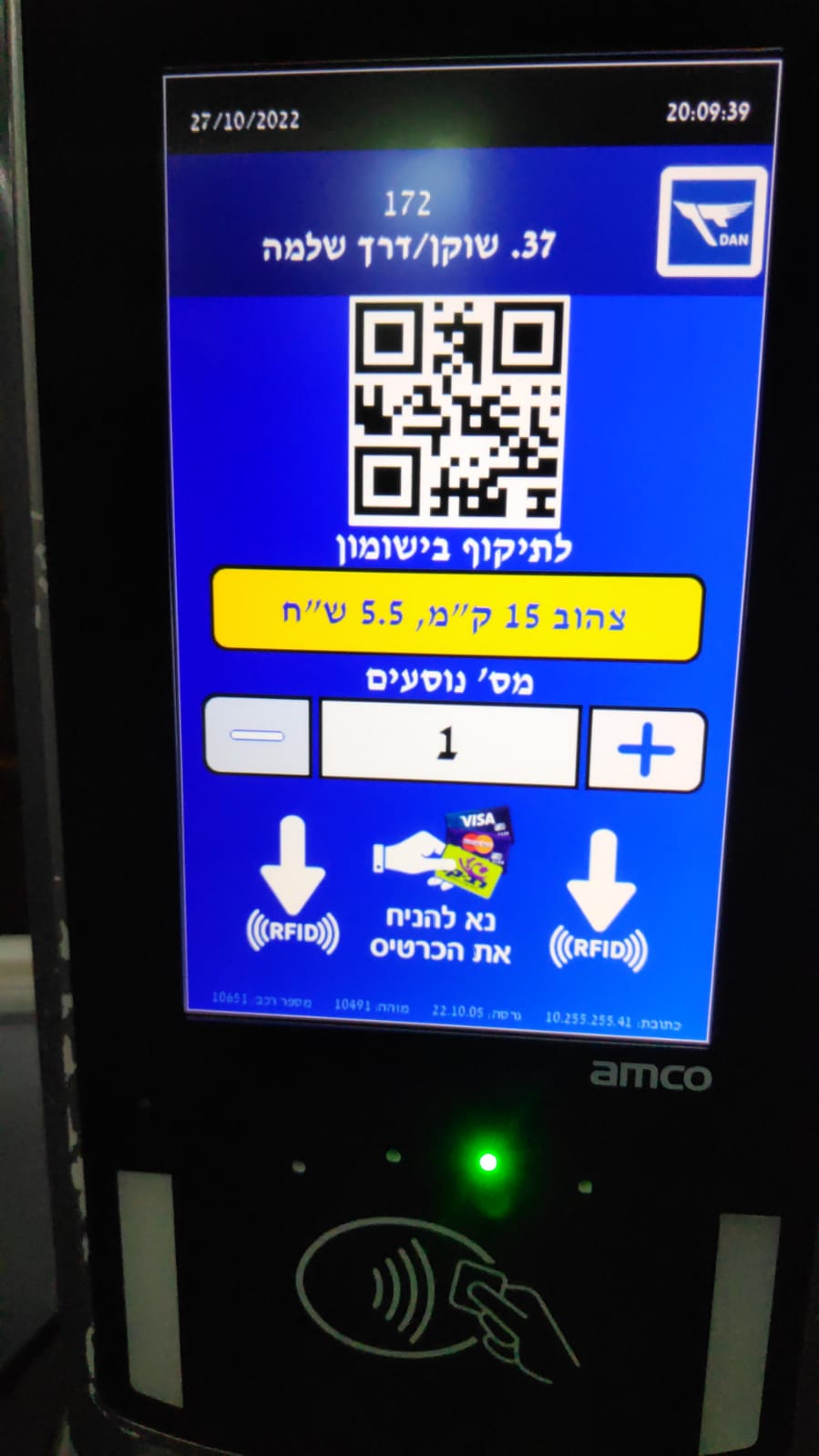
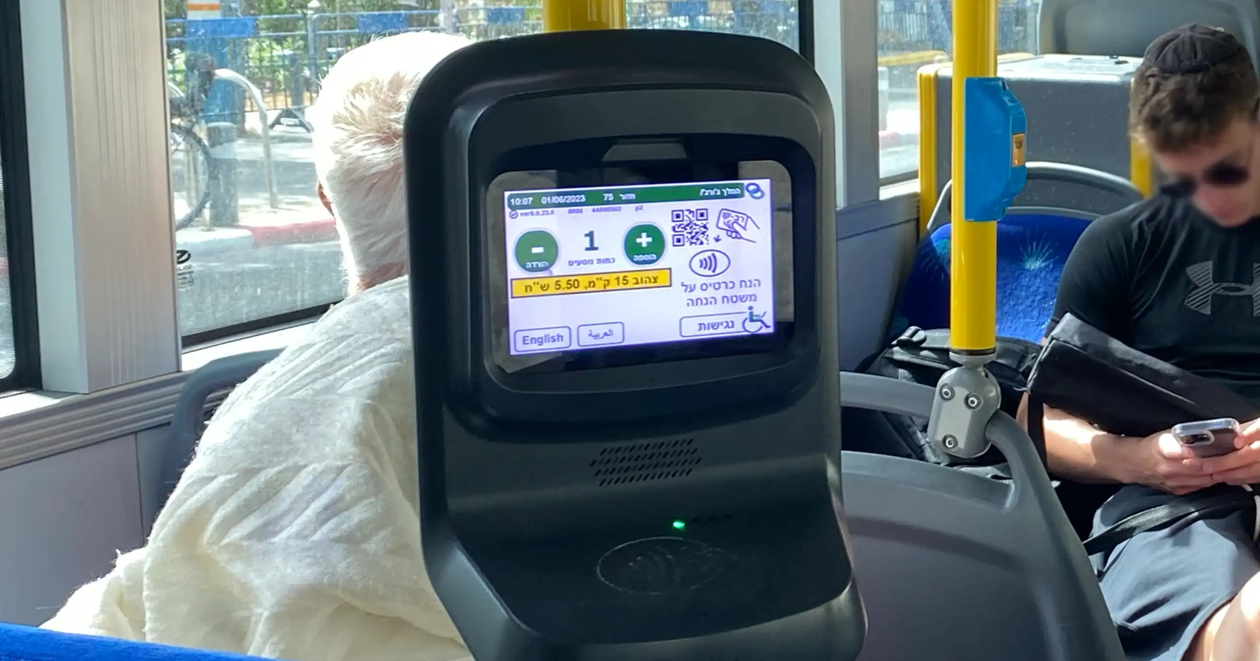
UX research and UX design – Validation systems used in buses and ticket machines located in central stations throughout Israel.
The UI was not under our responsibility and was decided and created by another company.
The project was done by the company Q-BEHAVIORAL THINKING
YEAR 2022
FIELD System UX
ROLE Freelance, UX Designer in Q-BEHAVIORAL THINKING team
01
The reform
The public transport service revolution “One Way” connecting Israel by public transport, making it easy and worthwhile to travel wherever, and whenever you like at one clear cost.
As part of the new reform, the trips change and the price is calculated according to the distance in kilometers.
02
The goal
Creating a user interface for public transport passengers in Israel that would easily explains how they should choose the most worthwhile and correct trip for them. Since todays travel rates are calculated according to the air distance in kilometers and not according to the starting point and the destination as it was done until today.
03
A few insights from the studies we conducted
Usage
Most of the respondents claimed that they use the default subscription which is loaded on their Rav-Kav card
Information
Passengers prefer to receive the information and updates about lines and changes in public transportation in places that are physically close to them.
Applications
The use of applications makes it easier for most passengers.
04
The Solution
In order to make it easier for passengers to deal with the new pricing method and plan the best trip for them, we should use several channels .
Public Awareness Campaign, The physical environment in the stations, buses, central stations and more.
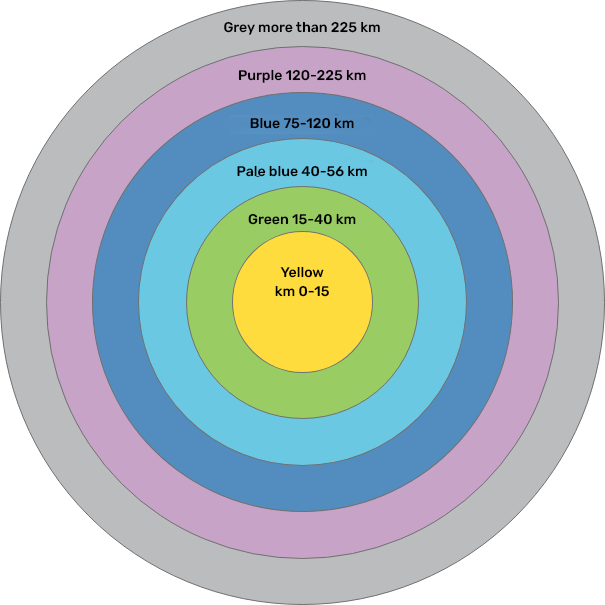
The concept for solving the accessibility of the reform is based on the principle of distance = color
This principle has been proven in other parts of the world and will help passengers make decisions quickly and efficiently. Adherence to this concept, together with support from additional sources of information (signs at bus stops, campaigns, brochures and various publications), will make it much easier for passengers in the new reality of fares, and will avoid confusion due to double meaning in terminology.
* The colors of the distances were carefully chosen by another company and in accordance with the accessibility rules
05
The solutions implementation of the new UX of Validators and the Tickets machines
In order to make it easier for passengers to deal with the new pricing method and plan the best trip for them, we should use several channels .
Public Awareness Campaign, The physical environment in the stations, buses, central stations and more.
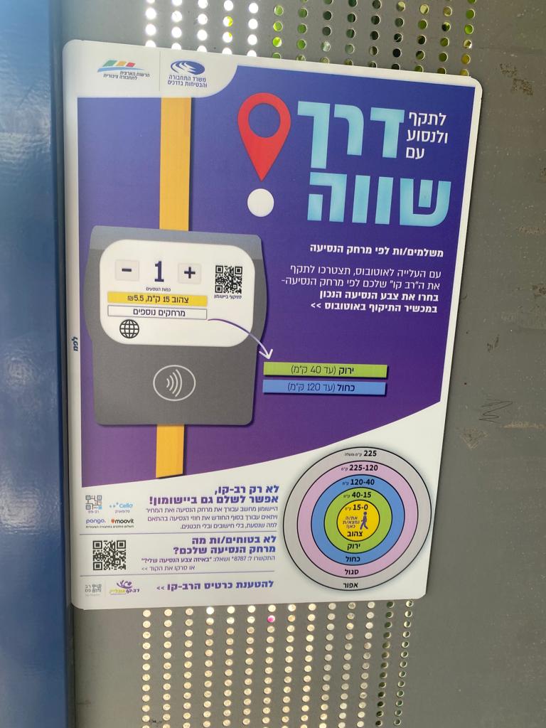
Bus Stations
People expect to see concrete information “on their way” and not search for the information.
Therefore, to help passengers choose the most worthwhile trip, passengers will meet the new reform already at the bus station.
Thus, already waiting at the station, the passenger can plan his trip and know what its trip color is.
The information that the passengers will be exposed to at the station and in the publications is connected to what they will see on the bus validator screen.
The learning process begins before the meeting point of the passenger with a validator on the bus.
* The UI of the system, the branding of the reform and the design of the ads, etc., were made by other companies and not as part of the presented project
Validators and tickets machines systems UX
Prevention of confusion and distractions among passengers.
Keeping clicks as few as possible.
Highlighting the default trip for the purpose of making the “One Way” reform accessible in the clearest way for the passenger.
